


- Learn
- The Onlinification Hub
- Content creation: How to create landing pages

Landing pages are an essential tool in your toolbox if you're aiming to get more conversions - whether they're blog subscriptions, newsletter signups, product enquiries, or meeting requests. But how can you make sure your landing pages are performing as well as possible? I'll try to explain in this article.
What is a landing page?
The purpose of landing pages is to give your site visitors a place to convert, ideally related to a specific product or service. Landing pages typically sit apart from the rest of your website - they stand on their own, and users will normally only arrive on them from sources like search, social media, or by clicking on a call-to-action (CTA) somewhere else on the site. Importantly, they must have a form of some kind. Landing pages can vary in length, design, and purpose, but it's not a landing page without a form that allows users to give you their contact details and convert.
Landing page examples
There's plenty of landing pages dotted around on zooma.se. Many of them lead to our content offers - when a user reads one of our articles, they'll find a CTA that leads to the landing page. They can fill in the form on this landing page to get the content offer, usually a PowerPoint or PDF guide that expands on the topic they read about in the article. After filling in the form, they get redirected to a thank you page, a simple page with a link to the content offer.
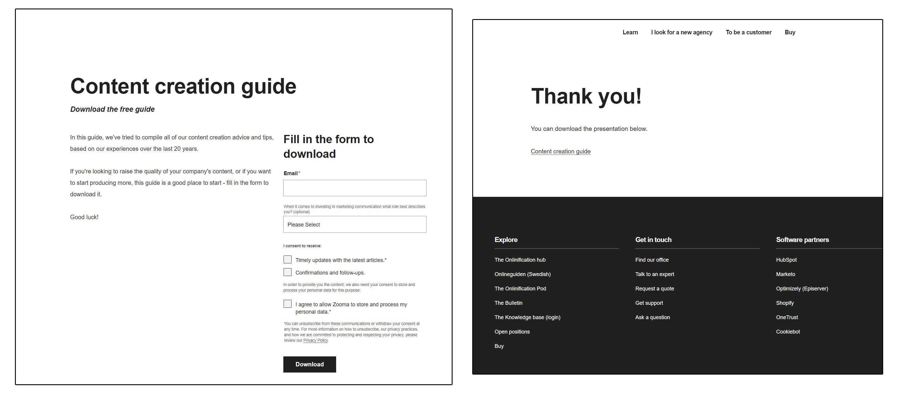 A typical Zooma landing page and the thank you page it leads to.
We also have a few landing pages where users can subscribe to our various blogs. Users can subscribe in plenty of places - on the blogs themselves; there's always a big 'Subscribe' button to the side of the page. However, on the blogs, these buttons are competing with lots of other elements. That's why the subscription landing pages are beneficial. There's nothing else on these pages apart from a short text and the subscription form. So we can link to them when we really want to make it as easy as possible to subscribe, for example, when encouraging subscriptions on social media.
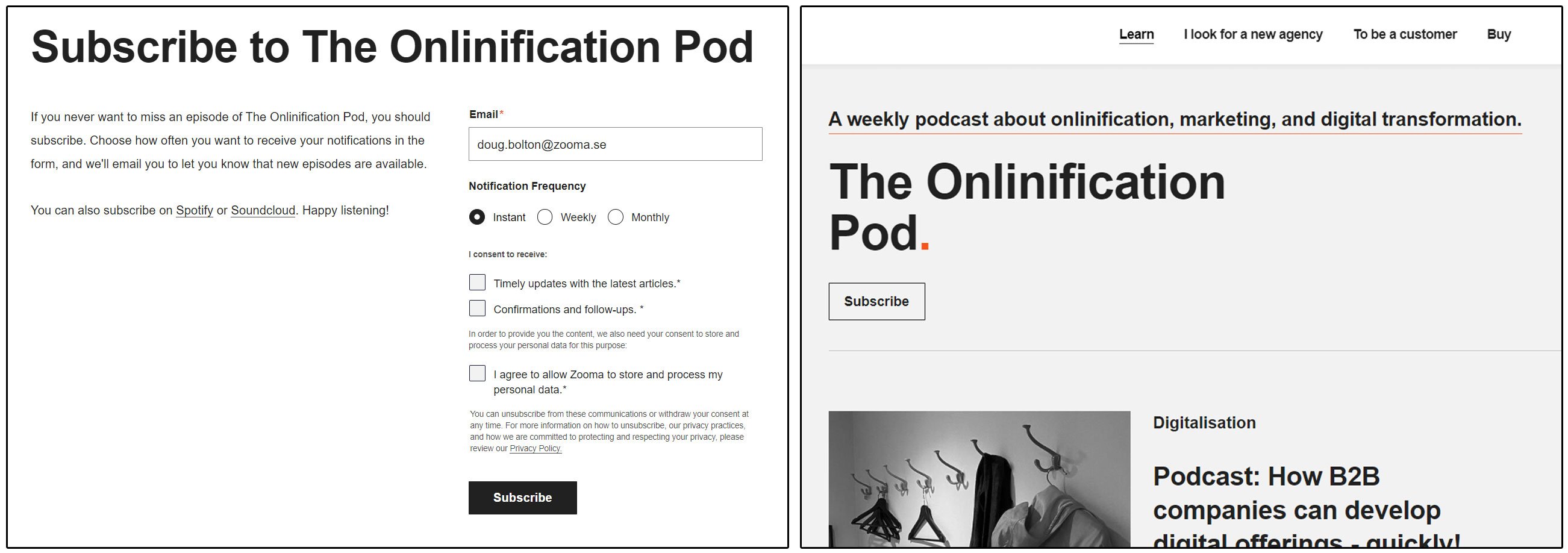
Users can subscribe on both the landing page and the blog, but fewer distractions are on the landing page.
Your company may have more kinds of landing pages. For example, if you have a temporary pricing campaign related to one of your products or services, you might create a landing page focusing on it, with a form that allows users to get in touch and take advantage of it.
If you want users to book meetings with your sales reps, download your app or register for an event you're running, landing pages are a great tool.
Landing page design
If you're ever in doubt about whether you're on a landing page, look for a menu. If you can't see one, you're probably on a landing page.
This is a common bit of best practice that most designers have embraced. The idea is to reduce the number of distractions and choices that the user is facing. When people arrive on the landing page, it should be clear that there is only one thing they can do - they shouldn't be tempted with a top menu full of links that take them away from the landing page. This tactic does actually increase conversion rate, so if you're using landing pages, I'd suggest changing your templates to remove the menu.
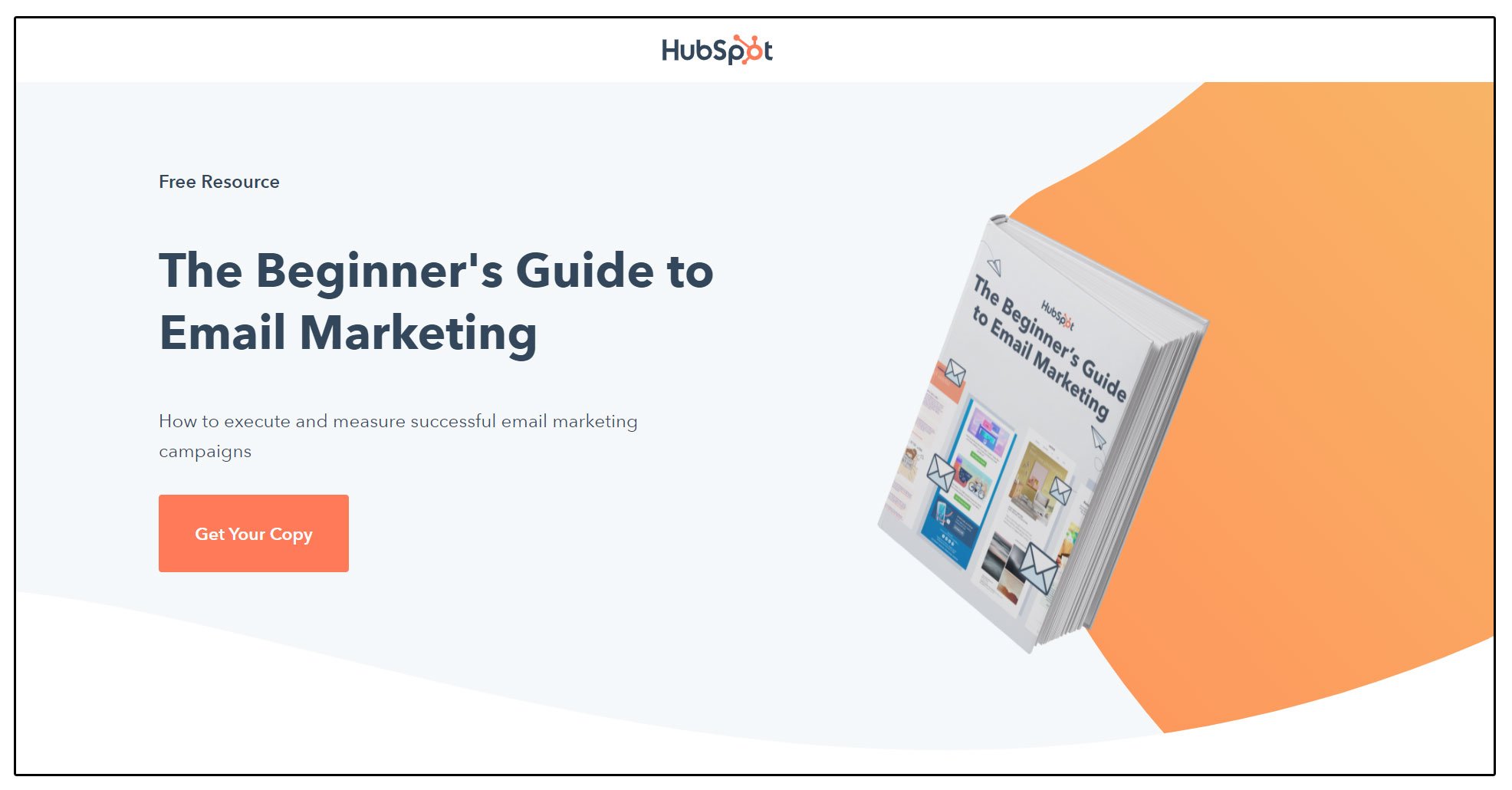
HubSpot removes the top menu on their landing pages and sticks with a clean, simple design.
Most landing pages usually have the form placed in a highly visible and prominent position. There's some debate over how important having content 'above the fold' really is in web design - but at least on landing pages, it's probably a good idea to make sure your users see the form as soon as the page loads. There's no sense in hiding it away at the bottom of a long page if your goal is for them to fill it in.
The design of your landing pages should naturally fit in with the rest of your visual identity. Fonts, colours, and sizes should be just the same as they are elsewhere. But one important aspect is to keep things simple. Don't overload the page with huge amounts of copy and giant images. Keep it short and clear, and the user will find it easier to understand why they should fill in that form and hand over their valuable contact details to you.
Tips for creating landing pages
- Keep them short - Depending on what you're promoting with your landing page, you might have a lot of information to share. If you're launching a new product and you want to explain every single wonderful feature, go ahead - just don't do it on the landing page. Your copy and any image elements you use should briefly explain why the user should convert and make it easier to do it. The more content you have on a landing page, the more distractions there are. This doesn't mean you can't have multiple sections that require the user to scroll - just make sure the information you're adding in them is relevant.
- Be clear - All information about what the user will get from converting should be clear and accurate. They should know what they're going to get by filling in that form. This means not over-inflating expectations by claiming the eBook you're giving away is the greatest work of literature ever published. And cynical conversion-boosting tools, like those fake countdown timers you sometimes see, should be avoided like the plague. They're a great way to ensure that users lose trust in your offering before they've even bought it.
And don't try to cram in too much. Don't stick two forms on the same page if you want to promote multiple offers through a landing page - e.g. a newsletter and a meeting booking. Create two pages, and make sure each one is laser-focused on its core purpose. - Use smart content - At Zooma, we use HubSpot CMS for our entire site, including landing pages. HubSpot's smart content tool can be used to really make the landing page experience smoother and increase the quality of your data and leads.
For example, we show different content to different groups by using smart content on our content offer landing pages. An entirely new visitor who has never converted before sees the standard landing page with the copy and the form. However, the link to the content is found directly on the landing page for our existing customers, and the form is removed.
This makes life easier for our customers. There's no point in making them fill out a form to get their contact information when we already have ongoing cooperation with them. But it also improves our data quality by giving a more accurate picture of what landing pages generate the most leads. You may be really pleased if one of your landing pages generates 100 conversions in a month - but if 90% of those are existing customers, you haven't gained that many new leads. By using smart content in this way, you can ensure that all the figures from your landing pages give an accurate picture of how many new leads you're converting.
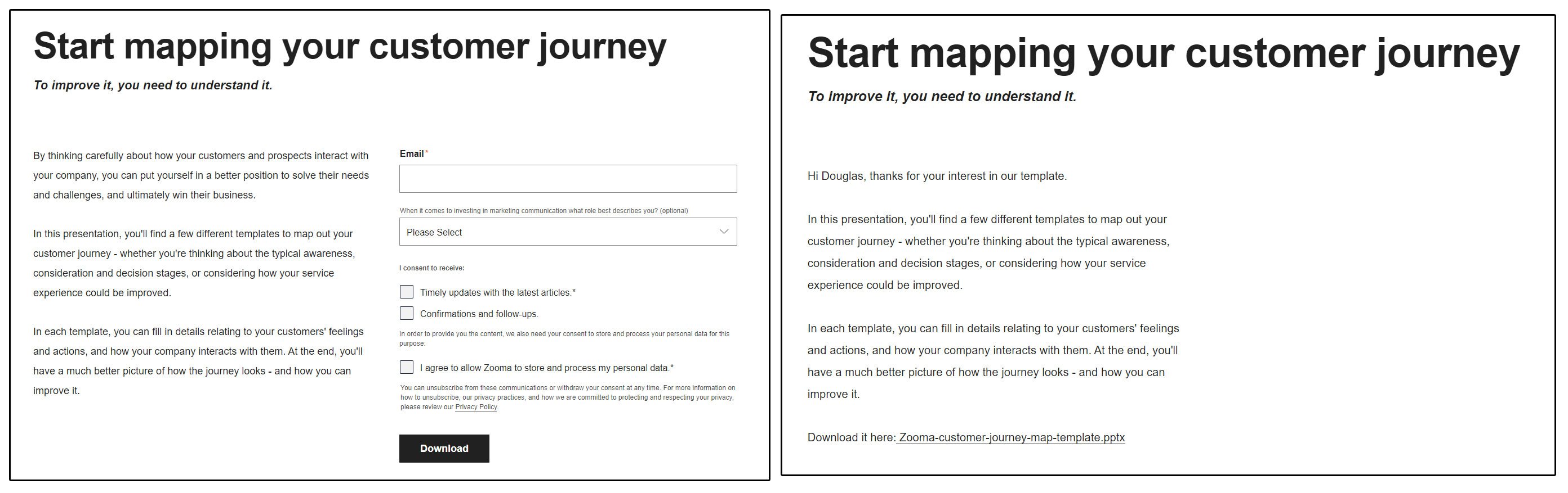
Unknown users see the standard landing page - but customers get a direct link to the content.
Hopefully, you've now got some new ideas for how to create and design your landing pages. But if you need a hand with the content you're going to promote with them, download our content creation guide below. You can also find out more about content in general with our in-depth guide to web content - it's got plenty of information about the different content types and formats you can use and explains why content is so vital.

Get the guide to content creation
